Difference between revisions of "Accessibility pledge"
m |
|||
| (8 intermediate revisions by 2 users not shown) | |||
| Line 10: | Line 10: | ||
= Slides = | = Slides = | ||
| + | |||
| + | == Make slides available before the presentation == | ||
| + | For people with visual impairments, it is very useful to have access to the slides in good time before the presentation. This allows for them to prepare themselves for the presentation and maybe access the slides using some preferred software or tool, like a screen reader or braille translator. Therefore it is very good if you can provide the slides already before the conference for the organizers to provide them via e.g. the schedule, or per request, if this is possible. | ||
== Make text and important visuals big enough to be read even from the back of the room. == | == Make text and important visuals big enough to be read even from the back of the room. == | ||
| Line 15: | Line 18: | ||
This applies to graphics on slides, videos, posters, and other | This applies to graphics on slides, videos, posters, and other | ||
non-electronic material. | non-electronic material. | ||
| + | |||
| + | [[File:Slides examples - size.png|300px|frame|center|On the left, the text and the graphic are too small which makes them difficult to read. On the right hand side, the text is made bigger and more space is also given to the graphics, making both easier to see. Note also that different patterns for different graphs make them distinguishable for people with e.g. color blindness.]] | ||
== Use an easy-to-read font face. == | == Use an easy-to-read font face. == | ||
| Line 20: | Line 25: | ||
Simple fonts with consistent thickness are often easier to read from a | Simple fonts with consistent thickness are often easier to read from a | ||
distance (as opposed to fonts where parts of the letters are thin, | distance (as opposed to fonts where parts of the letters are thin, | ||
| − | like Times New Roman). Avoid fancy fonts that are difficult to read. | + | like Times New Roman and most serif fonts). Avoid handwritten, calligraphic and fancy fonts that are difficult to read. |
| + | |||
| + | [[File:Slides examples - fonts.png|frame|center|The fonts used on the left slide are not the most readable for a presentation. [[http://www.google.com/webfonts/specimen/Open+Sans Open Sans]] is a good example of legible, sans-serifs font that works well on slides. It is available for free under the Apache licence.]] | ||
== Use sufficient color contrast. == | == Use sufficient color contrast. == | ||
| Line 32: | Line 39: | ||
on a dark background, and ensure that the weight of text is sufficient | on a dark background, and ensure that the weight of text is sufficient | ||
(for example, bold). | (for example, bold). | ||
| + | |||
| + | [[File:Slides examples - contrast.png|frame|center|Is is really important to have good contrast on the slides. It is also essential to keep in mind that contrast perception can change from a person to another: someone may have difficulties to differentiate two colours that you distinctly perceive as different. Finally, remember that your screen probably have much better contrast than a projector!]] | ||
== Make provided material accessible. == | == Make provided material accessible. == | ||
| − | If you are giving participants material, make it accessible. | + | If you are giving participants material, make it accessible. An [http://www.w3.org/WAI/presentations/WCAG20_benefits/ example of presentation material provided in both presentation format and web format (HTML and CSS)] is |
| − | |||
| − | provided in both presentation format and web format (HTML and CSS) is | ||
linked from the top of the page after "The Benefits of WCAG 2 | linked from the top of the page after "The Benefits of WCAG 2 | ||
presentation is available in 2 formats:". | presentation is available in 2 formats:". | ||
| Line 43: | Line 50: | ||
= Audio & video = | = Audio & video = | ||
| − | == | + | == Audio transcription == |
| − | For | + | If you plan to use audio in your presentation, keep in mind that there could be a lot of things preventing your audience to hear it correctly — or at all! For this reason, it is good to provide a visual support to help them understand. This can be a full transcript of the spoken text or a simple summary. |
| − | + | ||
| − | + | == Subtitle your videos == | |
| − | + | ||
| − | + | If you want to show a video, make sure that you have proper subtitles for it. This not only helps people who can't hear well or at all but also those who are not familiar with the language spoken in the video. Most commercial video come with subtitles. [http://www.universalsubtitles.org/ Universal subtitles] allow you to easily add subtitles to online videos. | |
| + | |||
| + | == Summarize the video == | ||
| + | |||
| + | Give a quick summary of the video, either before or after playing it. This helps everyone understand the content even if they have cognitive disabilities or cannot see the images properly or at all. | ||
= During the presentation = | = During the presentation = | ||
| Line 109: | Line 120: | ||
* http://www.w3.org/WAI/training/accessible | * http://www.w3.org/WAI/training/accessible | ||
| + | |||
| + | [[Category:FSCONS 2012]] | ||
| + | [[Category:Accessibility]] | ||
| + | [[Category:Policy]] | ||
Latest revision as of 22:12, 29 March 2015
Contents
- 1 Introduction
- 2 Slides
- 3 Audio & video
- 4 During the presentation
- 4.1 Speak clearly.
- 4.2 Use simple language.
- 4.3 Give people time to process information.
- 4.4 Be visible.
- 4.5 Use a microphone.
- 4.6 Ensure that all relevant sound is audible through the sound system.
- 4.7 Cover all displayed text.
- 4.8 Describe pertinent parts of graphics, videos, and other visuals.
- 4.9 Describe other visual information.
- 5 Sources
Introduction
Presentations that are accessible to people with disabilities are inclusive to many more audiences as well, including people who are not fluent in the language and people with different learning styles.
Although a good presenter should adapt his presentation to the particular needs of his or her audience, we we propose these guidelines to help make every presentation more accessible from the start.
Slides
Make slides available before the presentation
For people with visual impairments, it is very useful to have access to the slides in good time before the presentation. This allows for them to prepare themselves for the presentation and maybe access the slides using some preferred software or tool, like a screen reader or braille translator. Therefore it is very good if you can provide the slides already before the conference for the organizers to provide them via e.g. the schedule, or per request, if this is possible.
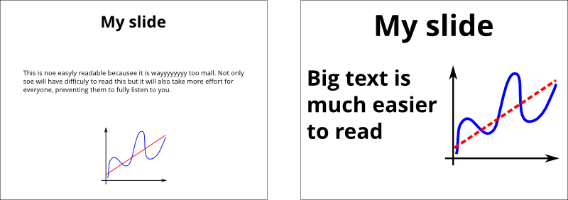
Make text and important visuals big enough to be read even from the back of the room.
This applies to graphics on slides, videos, posters, and other non-electronic material.

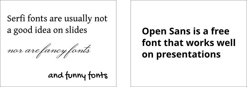
Use an easy-to-read font face.
Simple fonts with consistent thickness are often easier to read from a distance (as opposed to fonts where parts of the letters are thin, like Times New Roman and most serif fonts). Avoid handwritten, calligraphic and fancy fonts that are difficult to read.

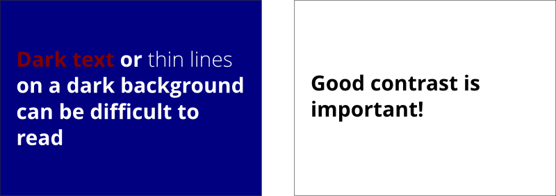
Use sufficient color contrast.
Color contrast guidelines and evaluation tools for web pages might be helpful to determine sufficient contrast (although the medium is different because those guidelines are specifically for web pages). Use appropriate background and text colors. Some suggest when presenting in a light room to display dark text on a light background. When presenting in a darkened room to display light text on a dark background, and ensure that the weight of text is sufficient (for example, bold).

Make provided material accessible.
If you are giving participants material, make it accessible. An example of presentation material provided in both presentation format and web format (HTML and CSS) is linked from the top of the page after "The Benefits of WCAG 2 presentation is available in 2 formats:".
Audio & video
Audio transcription
If you plan to use audio in your presentation, keep in mind that there could be a lot of things preventing your audience to hear it correctly — or at all! For this reason, it is good to provide a visual support to help them understand. This can be a full transcript of the spoken text or a simple summary.
Subtitle your videos
If you want to show a video, make sure that you have proper subtitles for it. This not only helps people who can't hear well or at all but also those who are not familiar with the language spoken in the video. Most commercial video come with subtitles. Universal subtitles allow you to easily add subtitles to online videos.
Summarize the video
Give a quick summary of the video, either before or after playing it. This helps everyone understand the content even if they have cognitive disabilities or cannot see the images properly or at all.
During the presentation
Speak clearly.
And avoid speaking too fast, so participants and sign language interpreters (if present) can better understand you and keep up.
Use simple language.
Avoid or explain jargon, acronyms, and idioms. For example, expressions such as "raising the bar" can be interpreted literally by some people with cognitive disabilities and can be confusing.
Give people time to process information.
Pause between topics. When you ask if anyone has questions, some people with cognitive disabilities will need extra time to form their thoughts into words.
Be visible.
Also be in good light so participants can see your face when you talk, which helps some people hear and understand better. Be careful not to face away from the audience to read projected material.
Use a microphone.
Even in a small room, some people might need the audio electronically, including people using ALDs/hearing loops and remote CART writers. Note that if you ask "Can everyone hear me OK?" some people might be uncomfortable saying that they cannot.
Ensure that all relevant sound is audible through the sound system.
For example, if the audience doesn't have a microphone, repeat their questions and comments into your microphone before replying.
Cover all displayed text.
Say all of the information that is on each slide. (This does not mean that you have to read the slide exactly as it is, it just means that you cover the visual information in what you say.)
Describe pertinent parts of graphics, videos, and other visuals.
Describe them to the extent needed to understand the presentation. (You usually do not need to describe decorative images.)
Describe other visual information.
For example, if you ask a question of the audience, summarize the response, such as, Speaker: "If you make your websites fully accessible, please raise your hand."...then: "About half raised their hand."